Verdantia: Redefining the Online Flower-Ordering Experience

Helping a local florist deliver joy with beauty, trust, and simplicity.

Client Name
Verdantia
Tools
Figma
Google Workspace
Miro
Maze
Timeline
6 Weeks
Summary

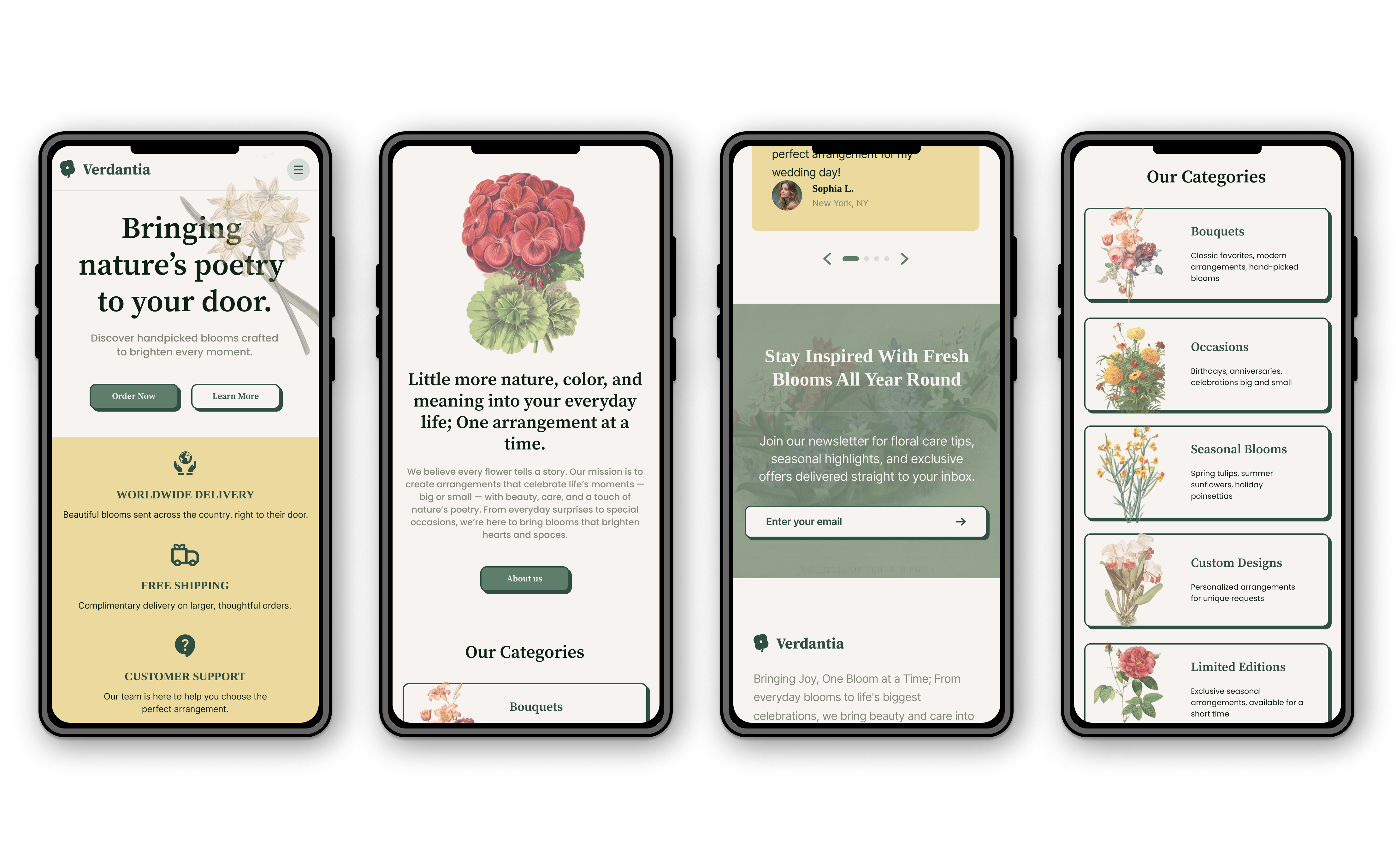
Verdantia is a local florist website that reimagines the online flower-ordering experience. Designed to make buying flowers as warm and poetic as receiving them, Verdantia combines elegance, functionality, and reliability — allowing users to easily browse, customize, and track their floral orders.The final product is a seamless, mobile-responsive website that balances emotional storytelling with usability, making it easy for anyone to send “nature’s poetry to your door.”

Problem Framing

The challenge:
Existing florist websites often lack warmth and usability. They typically offer limited floral selections, no customization, and no delivery tracking — frustrating users who want a smooth, personal gifting experience.

The goal:
Design a welcoming, intuitive website that:

  • Offers diverse floral categories and customization options
  • Provides secure order tracking and packaging transparency
  • Feels emotionally engaging and easy to navigate

Supporting insight:
User research showed that 70% of participants abandoned orders due to confusing layouts or missing customization features.

Role & Team

My Role: UX Designer, UX Researcher, Visual Designer

Responsibilities: User research, persona creation, wireframing, usability testing, high-fidelity prototyping, accessibility review, and responsive web design.

Approach

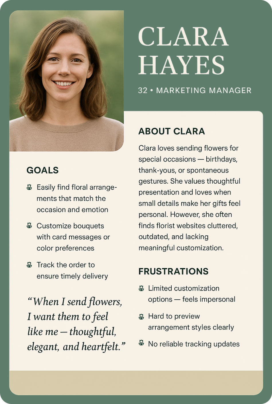
I conducted user interviews to understand motivations behind online flower purchases — most users were gifting loved ones and wanted confidence that their flowers would arrive fresh and beautifully packaged.

This led to the creation of Verdantia’s core principles:

  1. Trust through transparency — visible delivery information and packaging quality.
  2. Ease through clarity — clean layouts, clear CTAs, and well-organized categories.
  3. Emotion through aesthetics — nature-inspired visuals and warm tone.

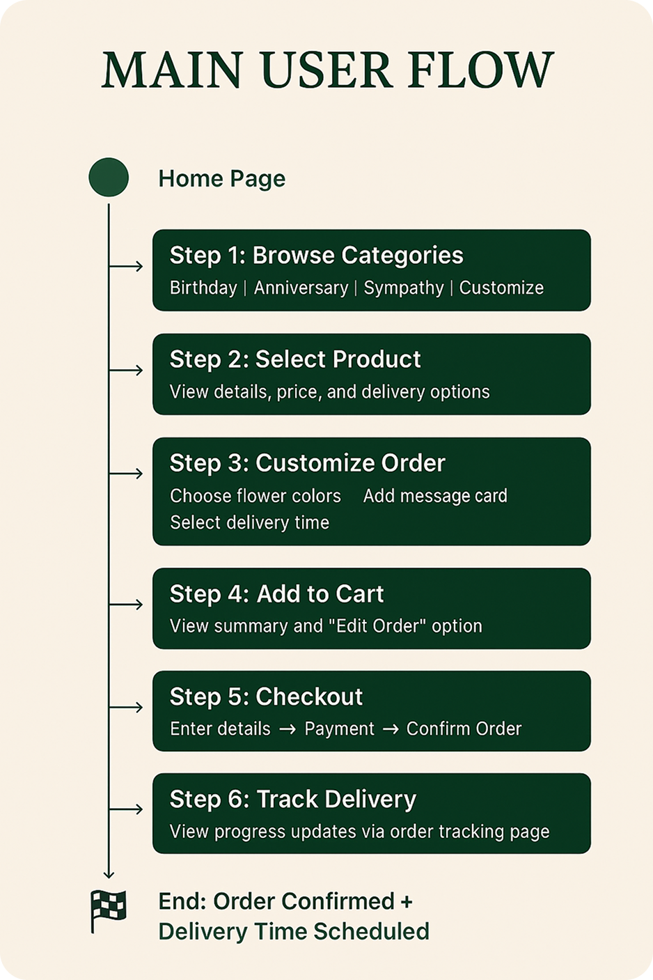
A sitemap and wireframes were designed to prioritize intuitive browsing, followed by usability testing to validate key user flows like product selection, customization, and checkout.

Challenges

Challenges:

  • Order modification: Users wanted to edit their orders after review.
  • Product discovery: The filtering system wasn’t intuitive in early iterations.
  • Input usability: Form fields were too small for quick typing on mobile.
Solution

I refined the design to enhance usability and trust:

  • Added “Edit” options during checkout to allow flexible order adjustments.
  • Introduced filter categories (by occasion, season, and collection) for quick access.
  • Enlarged form fields and increased white space for better readability.
  • Incorporated illustrated floral visuals and soft earth tones to build emotional connection.

Each decision supported a smooth user flow while aligning with Verdantia’s brand values of care and artistry.

Results & Impact

After redesign and testing:

  • Users completed the checkout process 35% faster than before.
  • All participants rated Verdantia as “easy to navigate” and “visually calming.”
  • Clear categorization and visual hierarchy improved findability and user confidence.

The final design successfully merged functionality with feeling — offering users a trustworthy and delightful online flower-ordering experience.
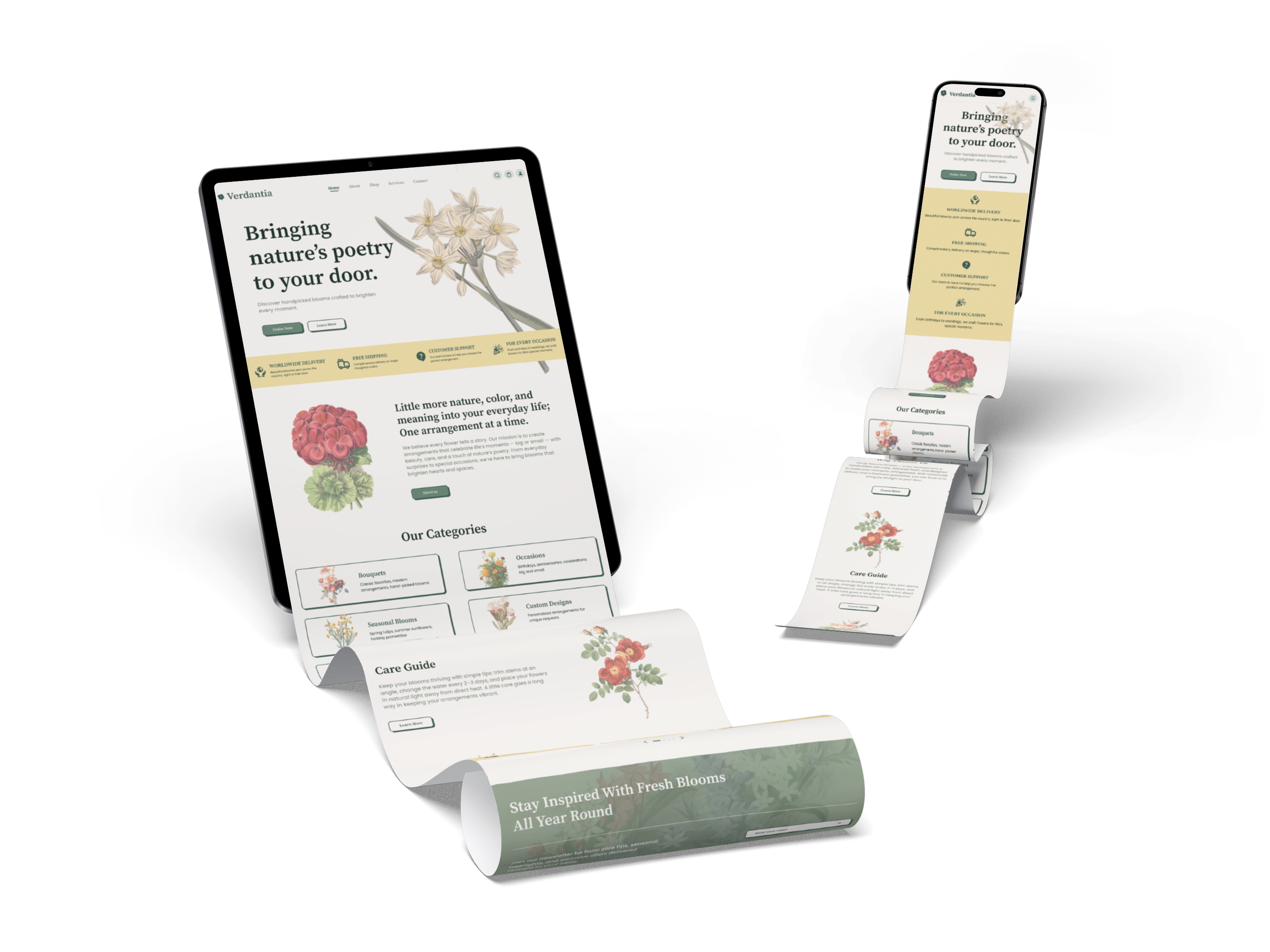
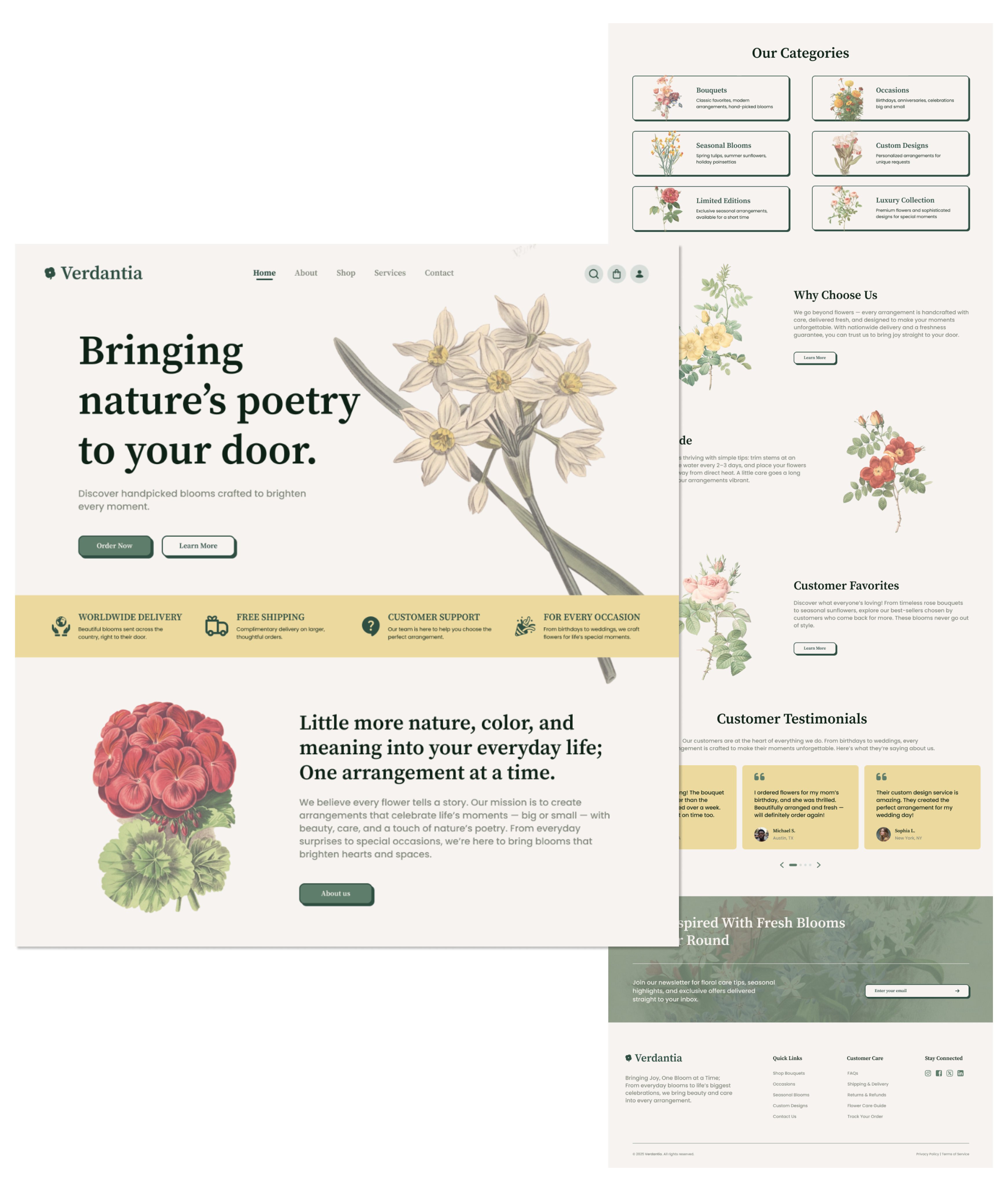
Design Higlights

Homepage features:

  • Hero message: “Bringing nature’s poetry to your door” — immediately emotional and brand-aligned.
  • Four value highlights (Delivery, Free Shipping, Support, Occasion-based shopping).
  • Clear categories for Bouquets, Occasions, Custom Designs, Seasonal & Luxury Collections.
  • Customer testimonials that add social proof and trust.
  • Newsletter section to maintain long-term engagement.

Visual Tone:

  • Soft, botanical illustrations to evoke nature.
  • Clean serif typography for elegance and readability.
  • Green accent color system symbolizing freshness and calm.
Next Steps
  1. Conduct A/B testing on CTA placements to optimize conversion rates.
  2. Expand Verdantia’s design system for mobile app use.
  3. Introduce user accounts for order history and personalized recommendations.
Key Learnings

Designing Verdantia reinforced the power of emotional usability — when visual poetry meets user trust, conversion and satisfaction naturally follow. Every layout decision was guided by empathy, simplicity, and the promise of bringing joy through thoughtful design.

What's next?
Hero Image Walmart
Walmart Project
Revolutionizing Customer Care Experience
Hero Image FAJ
Filipino Advocates for Justice
Non-Profit Organization Website Redesign