Sonoma County Public Utility Department
Responsive Website Redesign for a Government Agency


When we think about the design of a product either physical or a digital, first what comes to mind is how it looks, how it feels and how it works. With this approach, I have wanted to redesign the website of the public utility department to increase usability and to enable users to find information they need quickly and efficiently.I have conducted heuristics evaluation to identify common usability issues that occurs when users interact with the website of Sonoma County government agency and I have identified how we might bring possible solutions to resolve them.
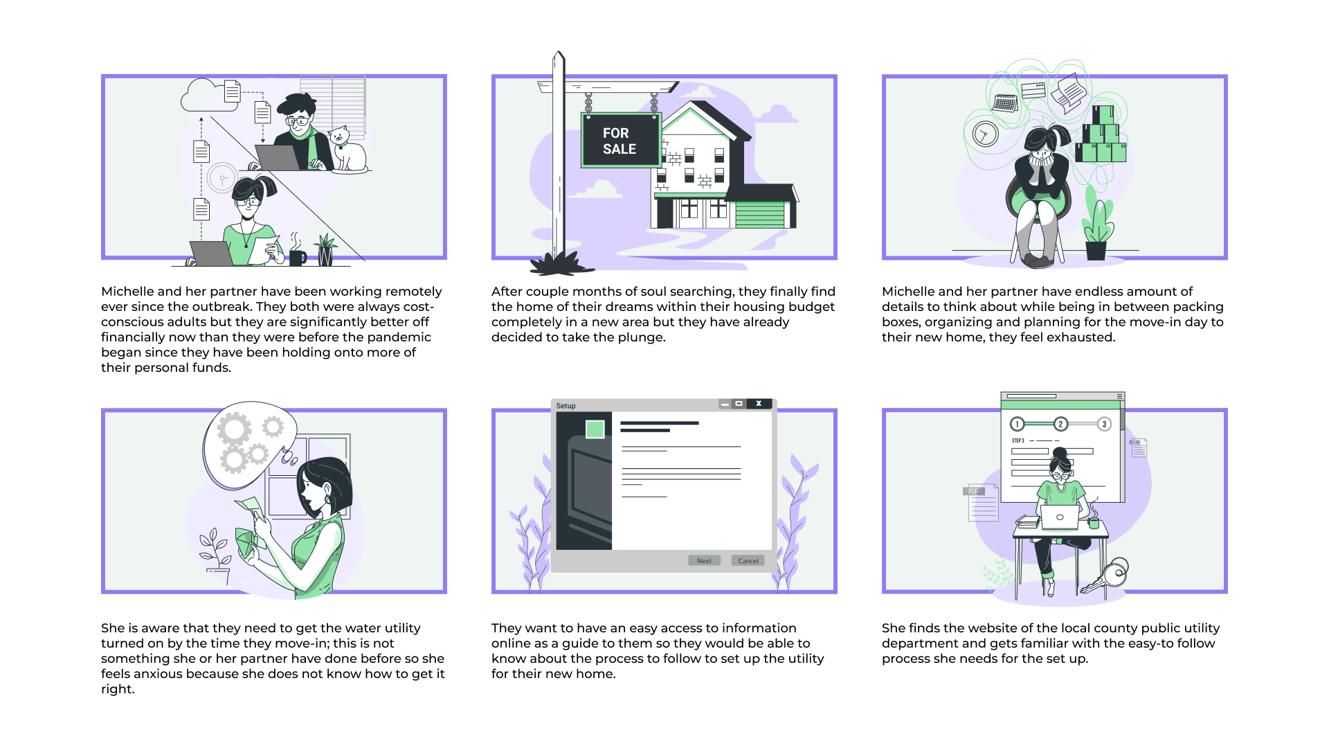
Most of the new home owners experience lapses through the process of determining how to set up utilities prior to their move-in day. Getting utilities set up is not something that first-time homeowners often experience and the process itself is not clear.
I will be conducting heuristic evaluations and usability testings to detect usability issues on the website of Sonoma county utility department. To improve the user experience, I aim to redesign the website, making it intuitive and simple for new homeowners to set up their water utility services.
At the beginning of the project, I was provided with essential information about the target audience, including their needs, behaviors, and motivations. I leveraged this information to create comprehensive user persona, which helped me to understand the users' perspectives and needs. I also developed user scenario and storyboard to visualize the user journey and ensure that my design decisions were aligned with the users' goals and expectations.
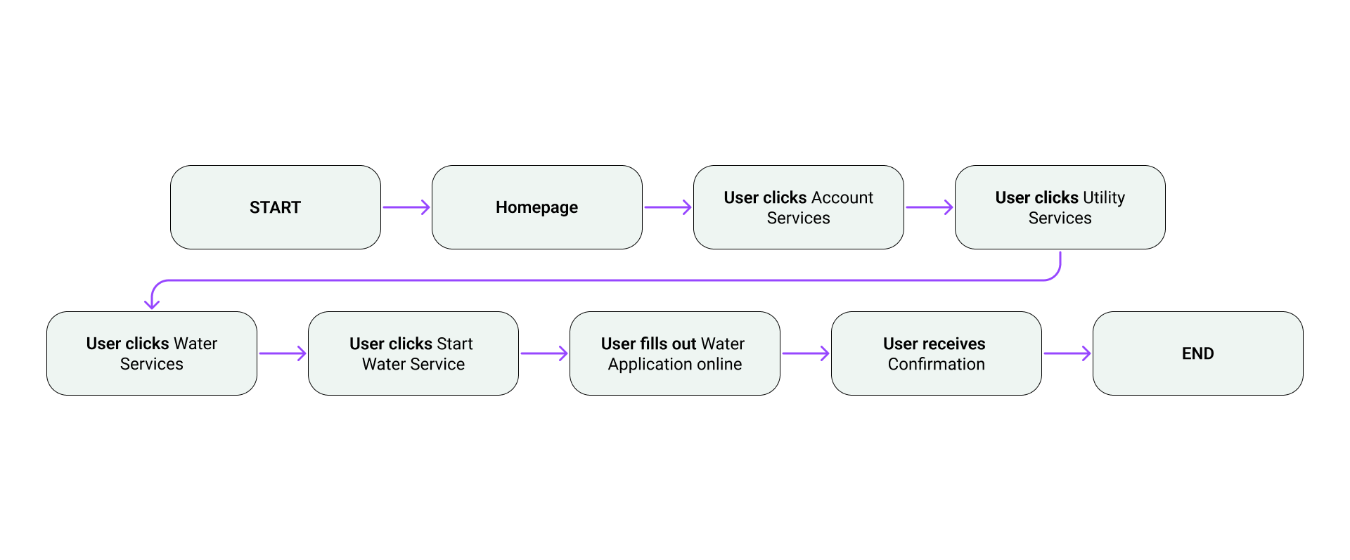
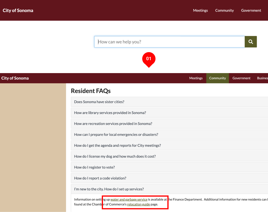
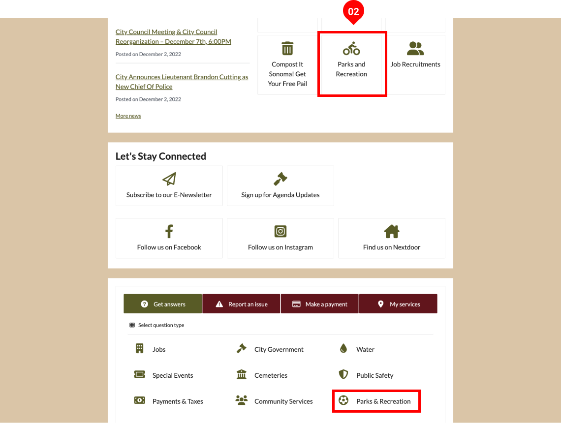
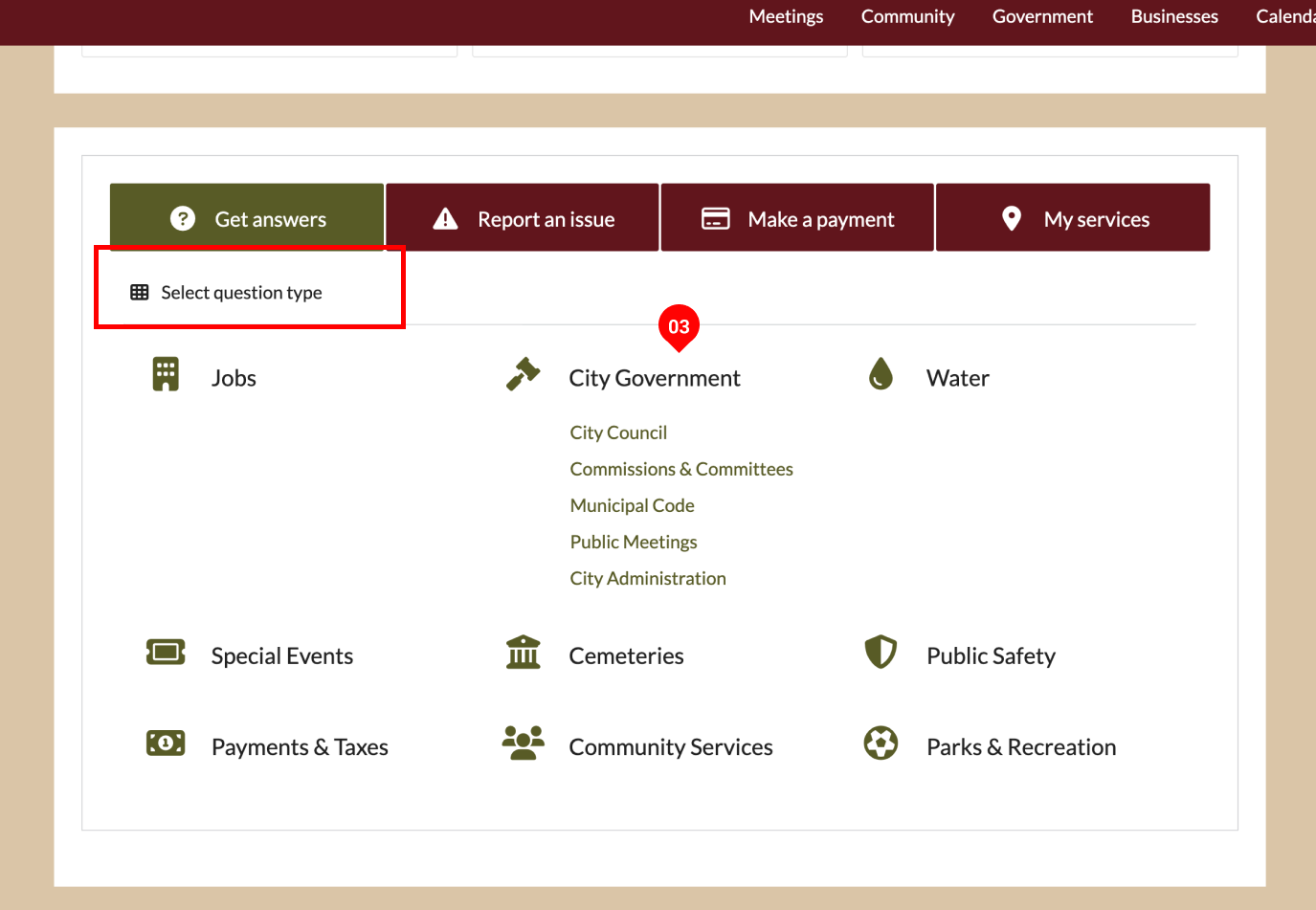
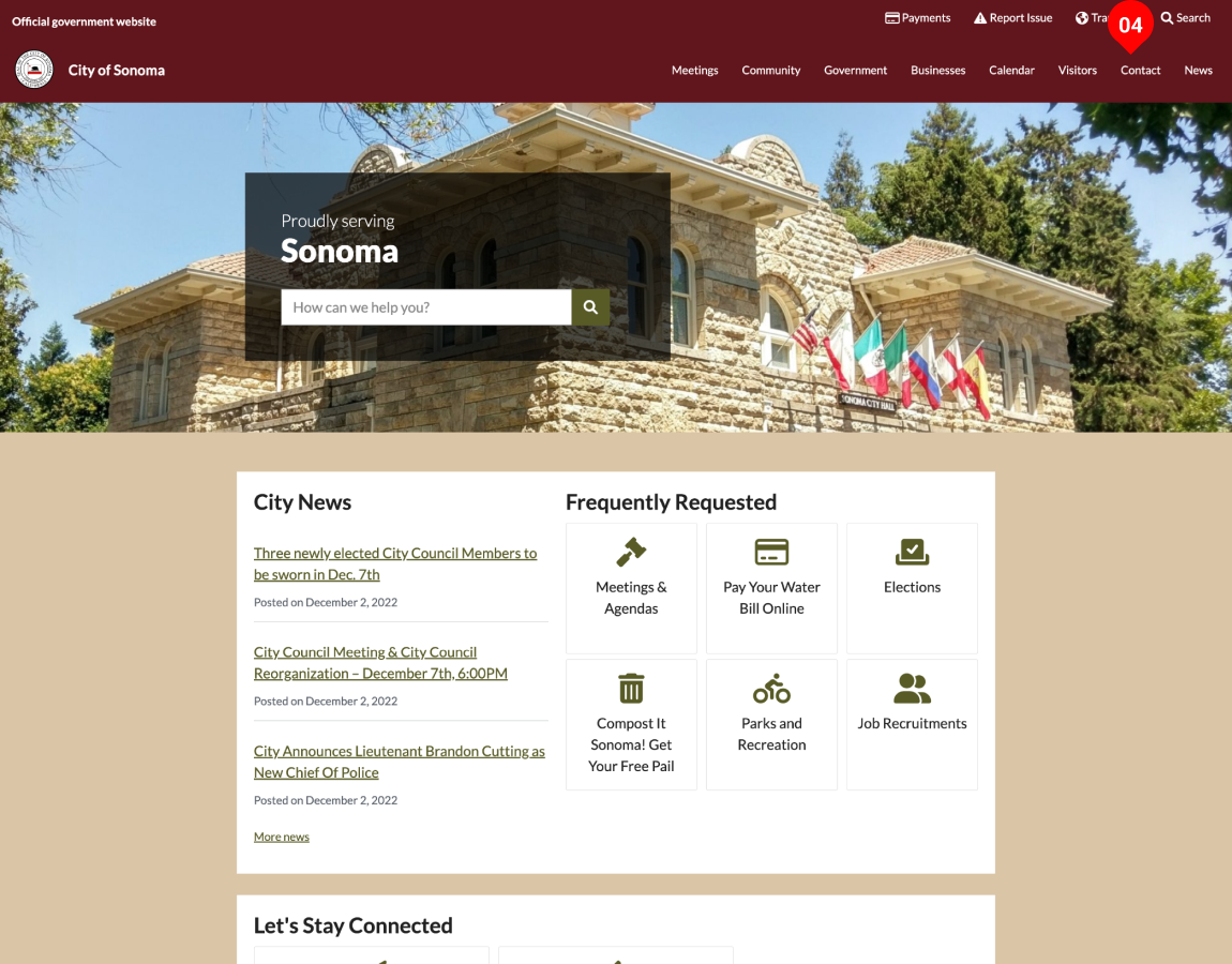
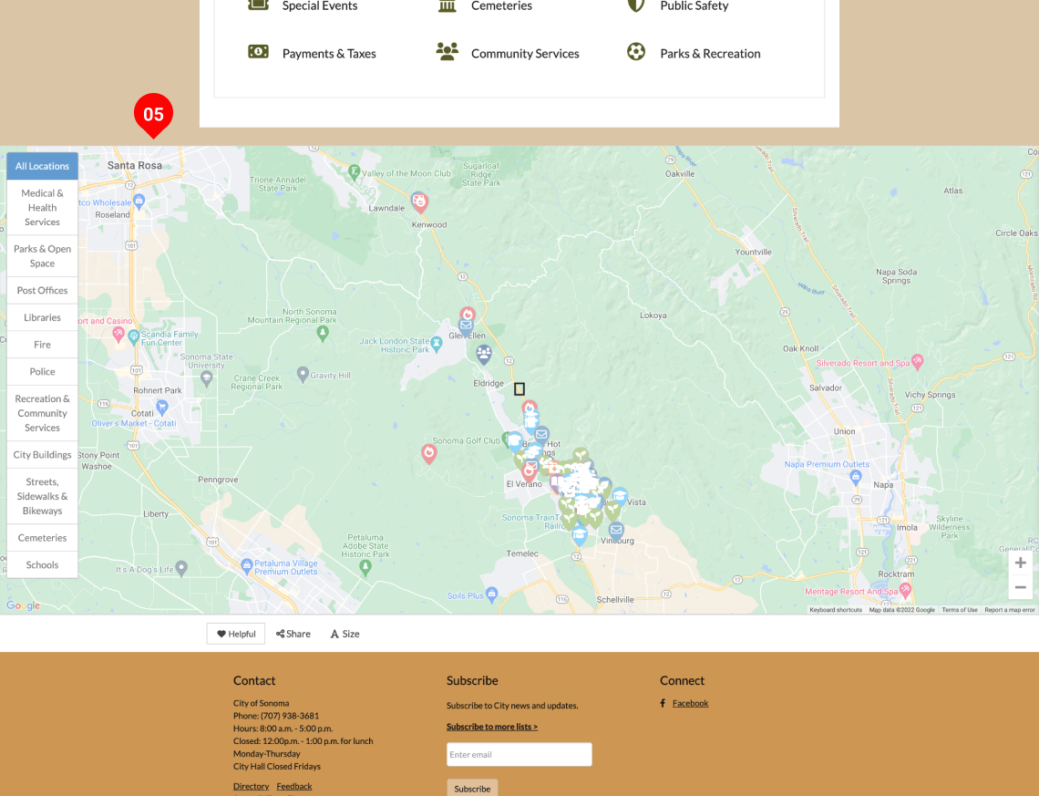
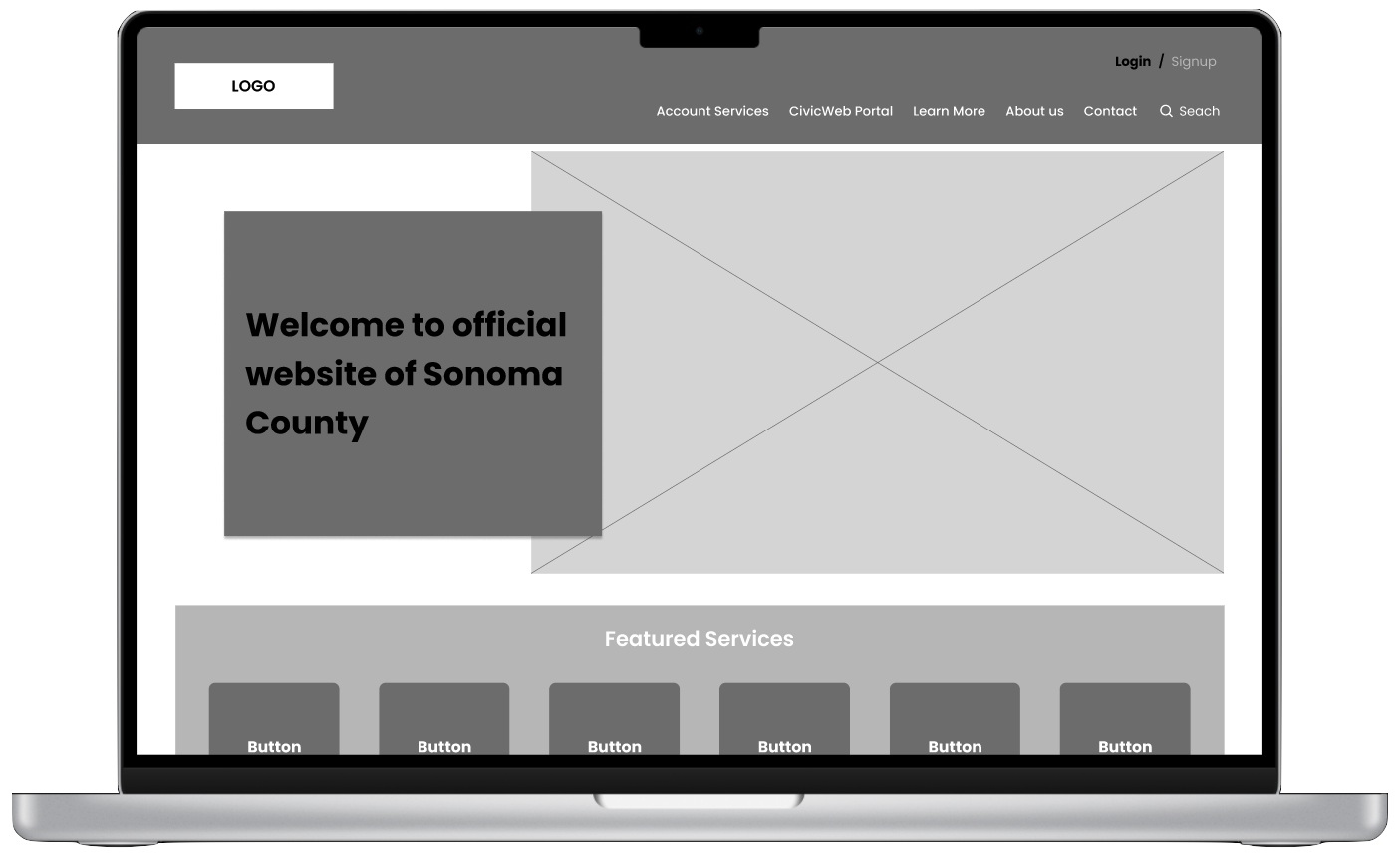
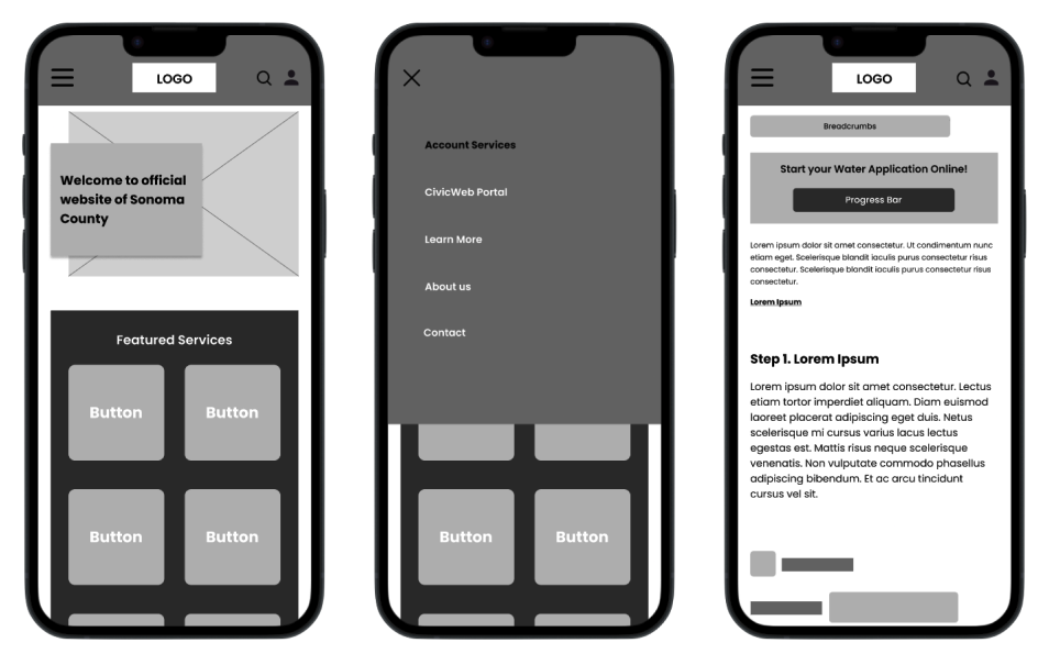
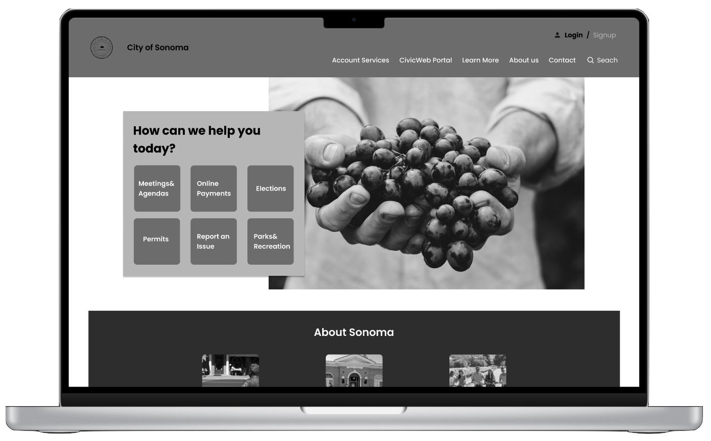
The current website had 5 separate routes to access the application forms for setting up the water utility, which causes confusion for new homeowners trying to complete the process. The complex navigation made it challenging for them to efficiently find and fill out the necessary forms. In the following, let's explore these access routes in detail.
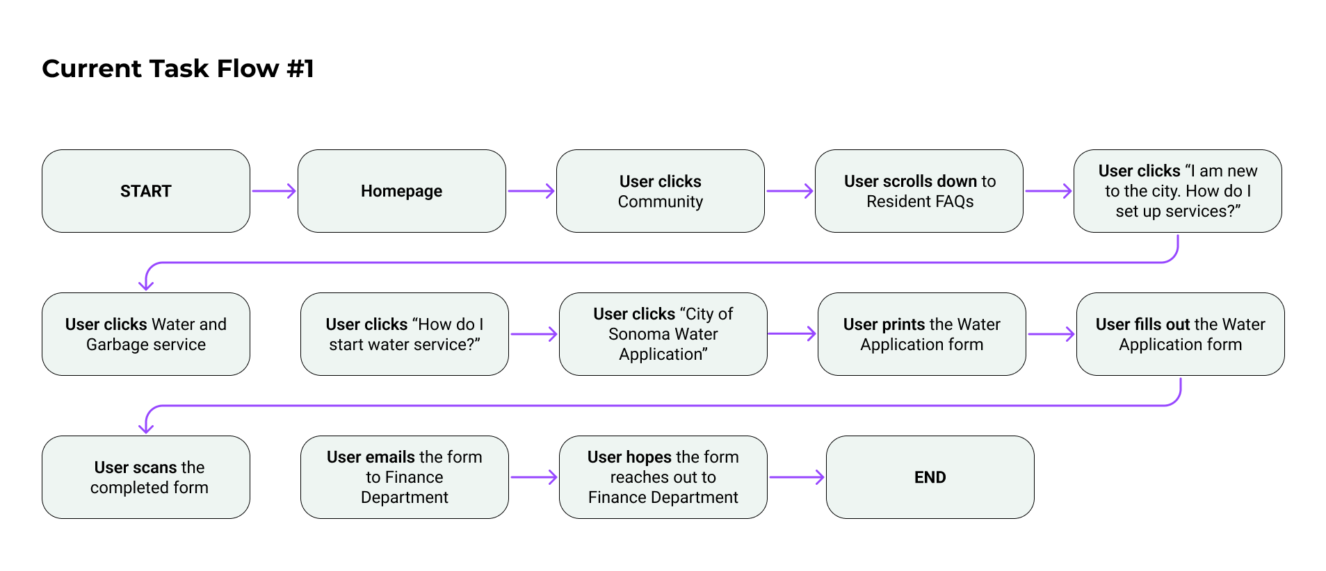
Having multiple access points to the same information can lead to confusion. Simplifying the process by having a single, straightforward method for accessing water utility application forms can help new homeowners achieve their goals and enhance the user experience of the website.
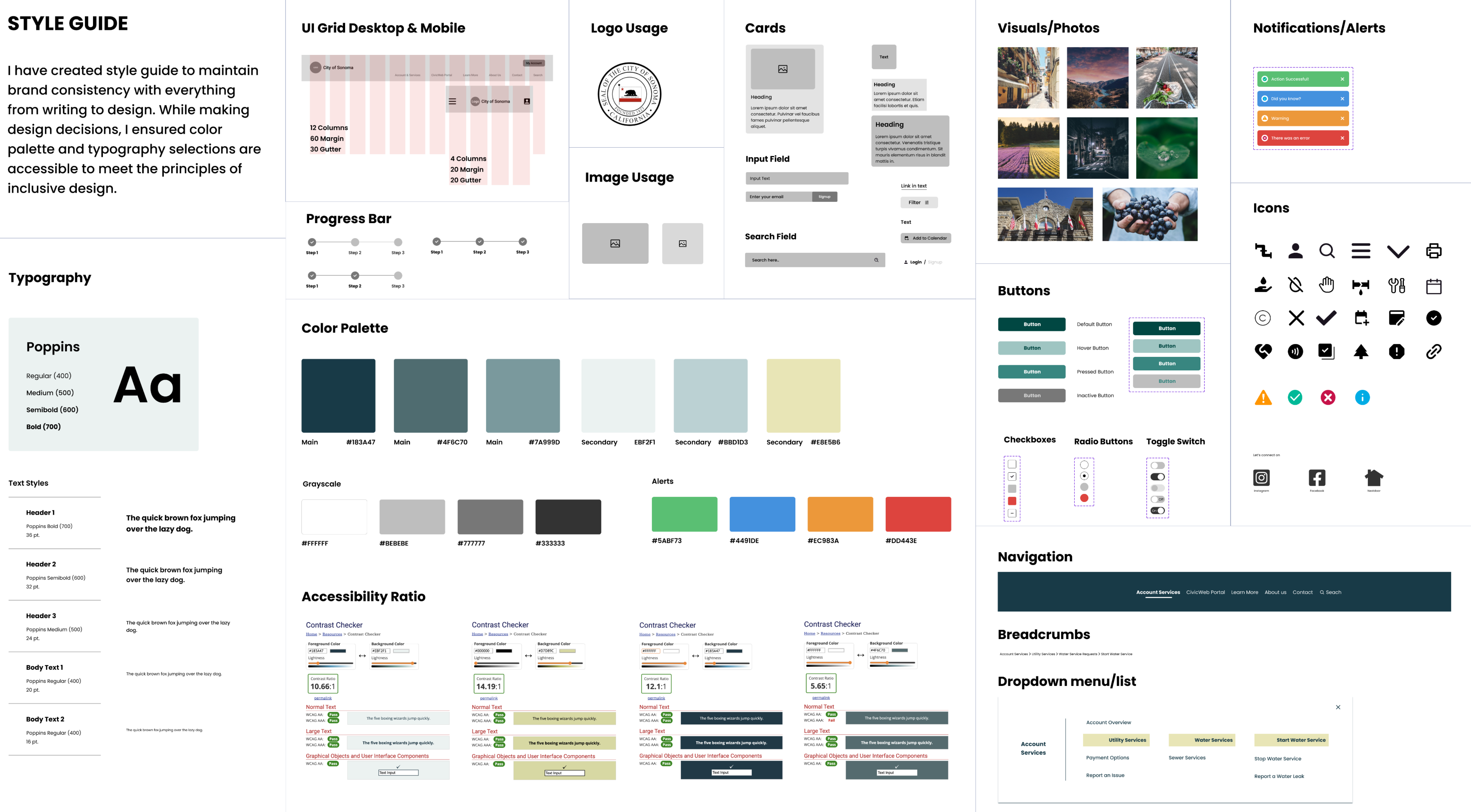
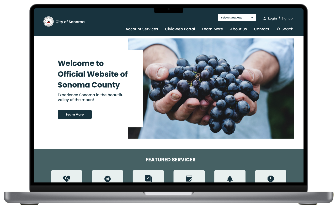
The purpose of the heuristic evaluation was to identify and illustrate the usability issues with the current website, such as its complicated and uninviting layout, and the inconsistent branding through the pages that cause confusion for visitors. By highlighting these issues, my aim was to provide insights into the necessary improvements needed to enhance the website's accessibility and improve the overall user experience.
Solution: Search to display the results in the same page, Add icons next links, Add breadcrumbs.
Solution: Use consistent icon pack throughout the page, create a text box so the user can search easily without leaving the current page.
Solution: Implement text-to-speech for web accessibility, and borders around the buttons so the user would clearly identify the buttons.
Solution: Add account features (Signup/Login) in the top nav bar so the user can create account. Highlight specific product and features based on the users preferences.
Solution: Minimize the information overload for the users by removing the map from the home screen and add smaller pieces of information instead.

Heuristic analysis is an efficient method for evaluating existing digital products, identifying common usability issues, and improving user satisfaction and experience to increase the likelihood of success.
The success of a product depends on how users perceive the usefulness and ease of the use product itself.
Perform additional usability tests to validate the successful addressing of pain points and carry out further user research to identify any new areas for improvement.

.jpg)
