DataSync Dashboard

Streamlining Data Management for CRM Users

Role
Product Designer
Tools
Figma
User Research
Data Analysis
Timeline
3 Weeks
About

DataSync Dashboard is a UX case study focused on improving how CRM users understand and manage their data activity.

The project explores how a centralized dashboard can provide immediate context, surface meaningful usage insights, and support feature discovery for both new and experienced users. The solution balances clarity and efficiency by prioritizing recent interactions, actionable metrics, and guided entry points into core workflows.

The Challenge

Design a dashboard for a browser extension that helps users manage and edit tabular data from their CRM system through an Excel-like interface. The dashboard needed to provide clear activity insights and help users, especially those new to the tool, understand their usage patterns and discover key features.

The Problem

Users of data management tools often struggle with:

  • Lack of visibility into their recent activities and data modifications
  • Difficulty onboarding and discovering available features
  • No centralized view of their editing patterns across different data interaction methods
  • Uncertainty about which features would benefit their workflow most

Research & Discovery

User Needs Analysis

Through stakeholder interviews and usage data analysis, I identified three primary user workflows:

  1. Grid Editing (Most common) - Quick edits to single tables
  2. Matrix Management (Second most important) - Managing relationships across multiple related tables
  3. File Imports - Bulk data uploads
Key Insights
  • Users needed immediate context about their most recent work
  • Activity metrics (active days, record updates) would help users understand their engagement
  • Low-usage users required proactive onboarding support
  • Power users wanted quick access shortcuts to resume work efficiently
Design Goals
  1. Provide immediate context - Show the most recent user interactions prominently
  2. Track meaningful metrics - Display active days and record update statistics
  3. Support onboarding - Offer contextual learning resources for new users
  4. Enable quick actions - Create shortcuts to commonly used features
  5. Encourage exploration - Surface tips and best practices

The Solution

Dashboard Architecture

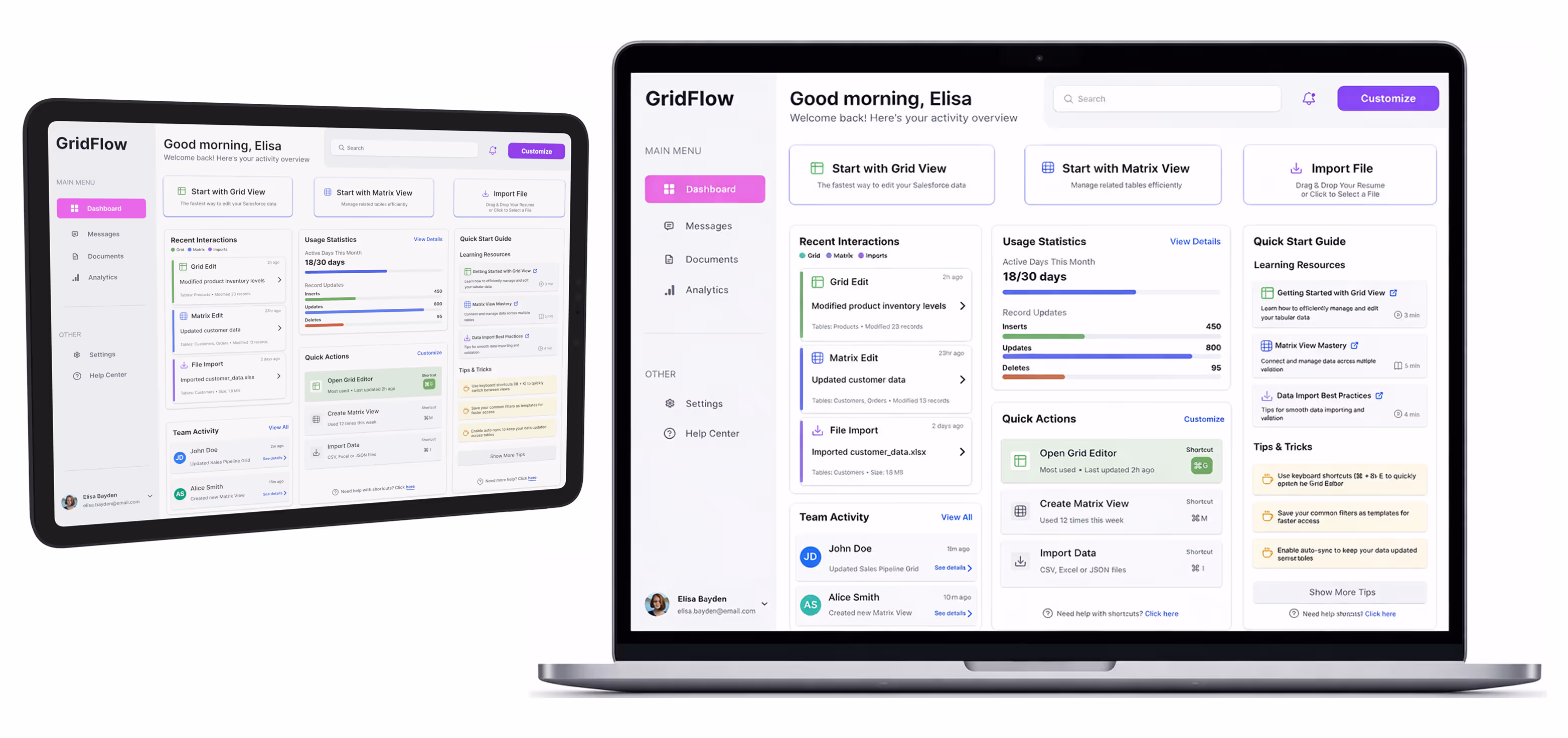
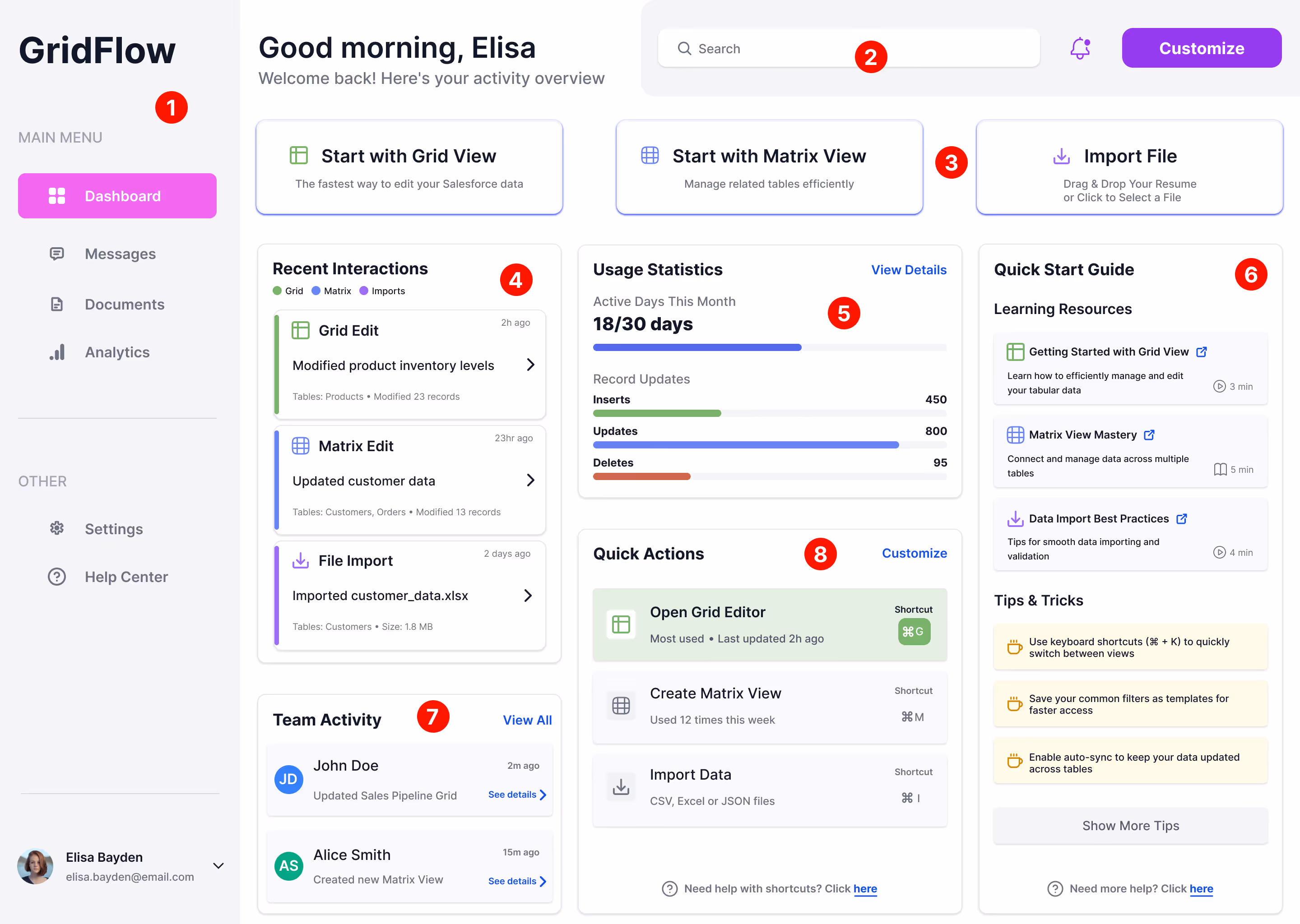
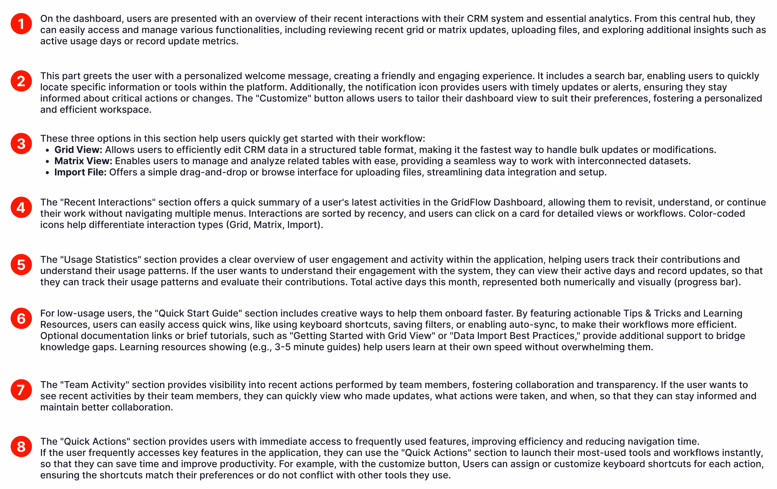
I organized the dashboard into five key sections:

1. Quick Start Cards (Top Priority)
Three prominent action cards for the main workflows:

  • Grid View - For single table editing
  • Matrix View - For multi-table data management
  • Import File - For bulk data operations

2. Recent Interactions Feed
A chronological timeline showing:

  • Type of interaction (Grid, Matrix, or Import)
  • Action performed
  • Tables affected and record counts
  • Time elapsed

This gives users immediate context to resume their work.

3. Usage Statistics
Visual metrics including:

  • Active Days - Tracked monthly to show engagement
  • Record Updates broken down by operation type:
    • Inserts (shown in green)
    • Updates (shown in blue)
    • Deletes (shown in red)

Color-coded bars make it easy to understand activity patterns at a glance.

4. Quick Actions Panel
Frequently used actions with:

  • Keyboard shortcuts displayed
  • Usage frequency indicators
  • Last updated timestamps

This section helps users build efficient workflows.

5. Quick Start Guide
Contextual learning resources including:

  • Learning Resources - Curated tutorials with time estimates
  • Tips & Tricks - Practical shortcuts and workflows
  • Links to detailed documentation

Design Decisions

Visual Hierarchy

Greeting & Welcome Message

  • Personalized greeting establishes friendly, human connection
  • Activity overview subtitle sets expectations

Color System

  • Green accents for Grid interactions (primary workflow)
  • Blue accents for Matrix interactions (complex workflows)
  • Purple accents for Import operations
  • Consistent color coding across all dashboard sections

Progressive Disclosure

  • Most important information (recent interactions, quick starts) appears first
  • Secondary information (team activity, statistics) follows
  • Supplementary content (tips, guides) available but not overwhelming
Information Architecture

Left Sidebar Navigation

  • Clear section separation (Main Menu vs. Other)
  • Icon + label combination for clarity
  • Active state clearly indicated

Density & Spacing

  • Generous whitespace prevents cognitive overload
  • Card-based layout creates clear content boundaries
  • Consistent padding and margins throughout
Interaction Design

Actionable Elements

  • All cards and list items are clickable with hover states
  • Arrow indicators suggest drilling into details
  • "View Details" and "See details" links provide explicit navigation cues

Contextual Help

  • In-context keyboard shortcuts reduce learning curve
  • Time estimates for learning resources set expectations
  • "Show More Tips" allows progressive disclosure
Success Metrics

To measure the dashboard's effectiveness, I proposed tracking:

  1. Task Completion Rate - Can users quickly identify and resume recent work?
  2. Time to First Action - How quickly do users engage after landing on the dashboard?
  3. Feature Discovery - Are users exploring Matrix view and shortcuts?
  4. Onboarding Completion - Do new users progress through learning resources?
  5. Return Engagement - Does the dashboard encourage daily/weekly usage?
Reflection & Learnings

What Worked Well

  • Activity feed design - Users appreciated seeing their recent work context
  • Color-coded interactions - Made scanning and pattern recognition effortless
  • Quick action shortcuts - Power users adopted keyboard shortcuts quickly

What I'd Improve

  • Customization options - Allow users to prioritize the metrics they care about
  • Filtering capabilities - Add date range filters for usage statistics
  • Team collaboration features - Expand team activity section for better collaboration visibility
  • Empty states - Design more engaging first-time user experiences
Key Takeaway

The most valuable insight was balancing information density with usability. While stakeholders wanted to show "everything," users benefited most from a focused, hierarchical approach that surfaced the most relevant information first, with progressive disclosure for deeper details.

Final Thoughts

This dashboard design successfully bridged the gap between providing comprehensive activity insights and maintaining an approachable, actionable interface. By prioritizing recent interactions and contextual learning resources, the design supports both new users discovering features and experienced users optimizing their workflows.

What's next?
Hero Image Walmart
Walmart Project
Revolutionizing Customer Care Experience
Hero Image FAJ
Filipino Advocates for Justice
Non-Profit Organization Website Redesign